<Form> Slots and composition API
We've already touched up the topic of customising the Form component in the Customize the Form guide. In this guide, we'll go a bit deeper and show you how to compose the Form component from scratch, using the Form primitives and the <Slot> component.
The <Slot> component was introduced with @slashid/[email protected]. This guide assumes you are using this version or newer.
Setup
You can follow the setup guide in order to get started quickly.
Adding a custom footer
Let's say we want to add a custom footer to our form. Previously, we could only specify the text content of the footer by passing the footer.branding text override to the ConfigurationProvider. This does not help us if we want to add a custom link to the footer. Now, we can achieve this by using the <Slot> component - it allows us to pass any child component which will then replace the default footer slot!
import { Slot, Form, ConfigurationProvider } from "@slashid/react"

function CustomFooter() {
  return (
    <ConfigurationProvider>
      <Form>
        <Slot name="footer">
          <footer style={{ paddingBlock: "2rem" }}>
            Custom footer with a{" "}
            <a style={{ color: "white" }} href="https://www.google.com">
              link to Google
            </a>
          </footer>
        </Slot>
      </Form>
    </ConfigurationProvider>
  )
}
This will render the following form:
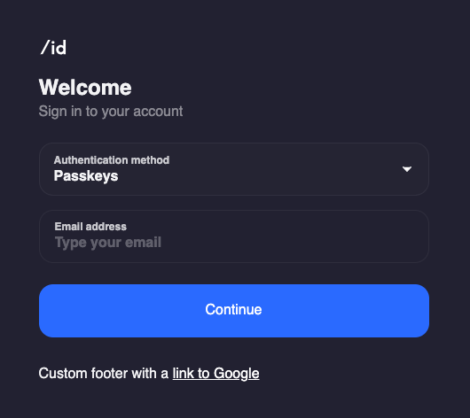
So by using the <Slot> component, we can easily replace any of the named slots of the form with our own implementation. Now we have only passed the footer slot, but there are more slots we could use to customise the Form further.
Mixing your components in
The <Slot> component is not limited to replacing the default slots - it can also be used to mix your components with the default ones. Let's say we want to add a link to our Terms & Conditions page on top of the submit button. We can do this by using the initial slot and the primitives exported by the Form namespace.
function Footer() {
  // footer from the previous example
}

function TermsAndConditions() {
  return (
    <p style={{ color: "grey", fontSize: "12px" }}>
      By continuing, you accept our{" "}
      <a style={{ color: "grey" }} href="https://www.slashid.dev/terms-of-use/">
        Terms & Conditions
      </a>
    </p>
  )
}

function CustomForm() {
  return (
    <ConfigurationProvider>
      <Form>
        <Slot name="initial">
          <Form.Initial.Controls>
            <Form.Initial.Controls.Input />
            <TermsAndConditions />
            <Form.Initial.Controls.Submit />
          </Form.Initial.Controls>
        </Slot>
        <Slot name="footer">
          <Footer />
        </Slot>
      </Form>
    </ConfigurationProvider>
  )
}
This will render the form in the following state:
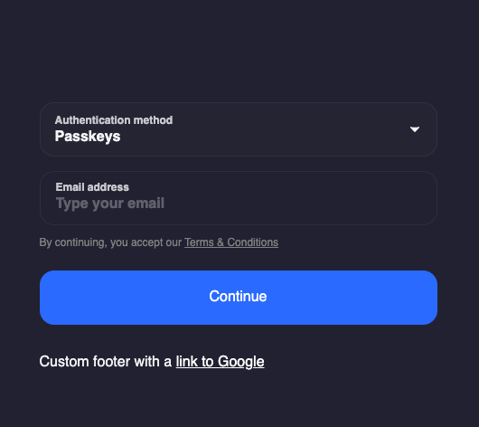
Notice something wrong with the above image? The logo and the Header are missing from the form now!
When replacing a layout slot, you need to make sure you include all the necessary components in your implementation. The form will only render what you pass in as children to the <Slot> component.
This is because we have replaced the initial slot with our own implementation, but we haven't included all the primitives in it. In order to fix this, we also need to add back the Form.Initial.Logo and Form.Initial.Header components:
function Footer() {
  // footer from the previous example
}

function TermsAndConditions() {
  // terms and conditions from the previous example
}

function CustomForm() {
  return (
    <ConfigurationProvider>
      <Form>
        <Slot name="initial">
          <Form.Initial.Logo />
          <Form.Initial.Header />
          <Form.Initial.Controls>
            <Form.Initial.Controls.Input />
            <TermsAndConditions />
            <Form.Initial.Controls.Submit />
          </Form.Initial.Controls>
        </Slot>
        <Slot name="footer">
          <Footer />
        </Slot>
      </Form>
    </ConfigurationProvider>
  )
}
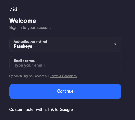
This looks better now:
There are quite a few things to unwrap here, so let's go step by step. The initial slot of the Form component is composed of the following components:
Form.Initial.LogoForm.Initial.HeaderForm.Initial.Controls
Then the Form.Initial.Controls component itself is also a composition consisting of:
Form.Initial.Controls.Inputrendering the form fieldsForm.Initial.Controls.Submitrendering the submit button
So in order to add an arbitrary component like TermsAndConditions above between the form fields and the submit button, we had to decompose the Form and construct it again by composing it with a mix of our own components and the exposed primitives.
Rendering your own form fields
The Form.Initial.Controls.Input component is responsible for rendering the appropriate form fields based on the factors form was configured to use. Specfically, this component solves the following problems for us:
- inspect the factors and determine the handle types required based on them
- if more than one handle type is required, render a select field to allow the user to choose which handle type to use
- render the appropriate input field for the selected handle type
- render the appropriate error message if the input is invalid
So it turns out that the Form.Initial.Controls.Input component is quite powerful and can save us a lot of time. Still, there might be use cases when we want to handle this ourselves - for example, if we want to render a custom input field, with additional validation logic.
This is an advanced API - please check the docs carefully before using it.
We can do this by passing a function as a child to the Form.Initial.Controls.Input component:
<Form.Initial.Controls>
  {({ handleSubmit, factors, handleTypes }) => {
    return <CustomForm handleSubmit={handleSubmit} factors={factors} handleTypes={handleTypes} />
  }}
</Form.Initial.Controls>
This allows us to reuse the behaviour of Form.Initial.Controls while implemeting a custom UI composed of our own components and the primitives. <CustomForm> will receive a handleSubmit function which it can use to submit the form, and the factors and handleTypes props which it can use to render the appropriate input fields.
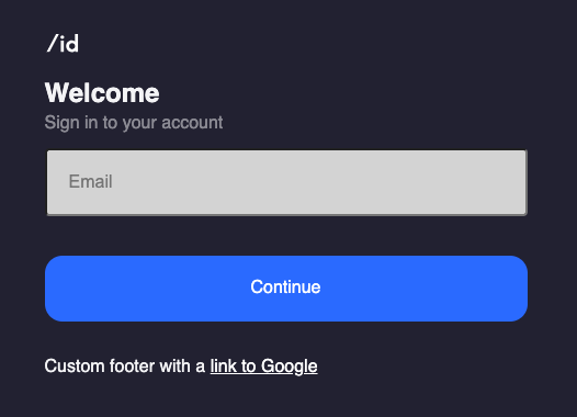
It can be implemented like this:
const CustomForm = ({ handleSubmit, factors, handleTypes }) => {
  const [email, setEmail] = useState("")
  // factors = [{method: "email_link"}]
  // handleTypes = ["email_address"]

  return (
    <form
      style={{ width: "100%" }}
      onSubmit={(e) => {
        e.preventDefault()
        // we only wanted to use the email_link method, otherwise we could have used the handleTypes and the factors to determine the input type
        handleSubmit({ method: "email_link" }, { type: "email_address", value: email })
      }}
    >
      <input
        style={{
          width: "100%",
          boxSizing: "border-box",
          backgroundColor: "lightgrey",
          padding: "1.25rem",
          fontSize: "1rem",
          margin: "0.75rem 0",
          borderRadius: "0.25rem",
        }}
        type="email"
        value={email}
        onChange={(e) => setEmail(e.target.value)}
        placeholder="Email"
      />
      <Form.Initial.Controls.Submit />
    </form>
  )
}
Notice that we are still using the primitive Form.Initial.Controls.Submit component to render the submit button. We could apply the same principle to render a custom submit button as well, but this is out of scope for this guide - the approach is the same as above.
Let's take a look at the final result:
Bonus: rendering a custom error state
When we want to have more control over the error state of the Form, we can use the error slot together with the Form.Error primitive to handle errors ourselves. This is useful if we want to render a custom error message, or if we want to render the error message in a different place than the default one.
import { Errors } from "@slashid/slashid"

function ErrorState({ context, retry, cancel }) {
  return (
    <div>
      <h3>{context.error.message}</h3>
      {Errors.isRateLimitError(context.error) && <p>You were rate limited!</p>}
      <button onClick={retry}>Retry</button>
      <button onClick={cancel}>Cancel</button>
    </div>
  )
}

function CustomForm() {
  return (
    <ConfigurationProvider>
      <Form>
        <Slot name="error">
          <Form.Error>
            {({ context, retry, cancel }) => <ErrorState context={context} retry={retry} cancel={cancel} />}
          </Form.Error>
        </Slot>
      </Form>
    </ConfigurationProvider>
  )
}
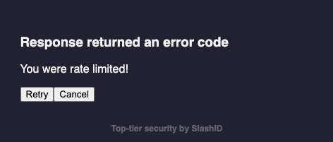
The screenshot below shows the error state rendered when a rate limit error happens - we used some utilities from the Errors namespace to determine the type of the error.
Conclusion
In this guide, we've seen how to use the <Slot> component to compose the Form component from scratch. We've also seen how to use the Form.Initial primitives to render our own form fields. This is a powerful API which allows you to customise the form to your needs, but it is also quite complex. If you are not sure how to use it, please reach out to us - we'd be happy to help and receive any feedback you might have!